The kitchen is often considered the heart of the home, a place for cooking, gathering, and entertaining. As such, its aesthetic plays a crucial role in setting the mood for your entire living space. Choosing the right paint color for your kitchen walls or cabinets can dramatically transform its look and feel. Greater Boston Contractors understands the nuances of kitchen design and offers these top color suggestions and design tips to help you create a beautiful, functional, and stylish kitchen that reflects current US trends and timeless appeal.
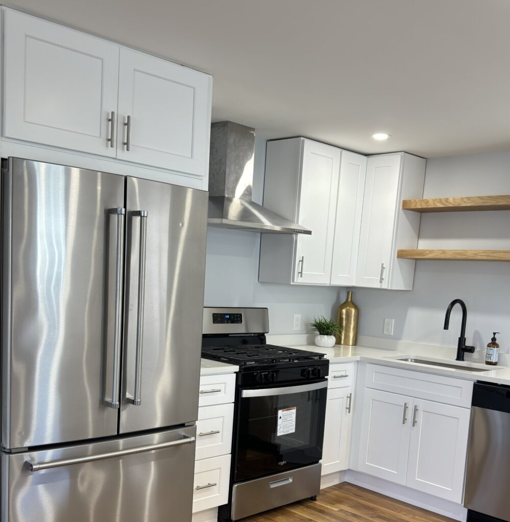
Popular kitchen color trends in 2025
Kitchen design trends are always evolving, and 2025 sees a shift towards warmer, deeper, and more nature-inspired hues, moving away from some of the cooler, starker tones of previous years.
- Warm Earth Tones: Think beyond beige and gray. Shades of brown, mushroom, clay, and even rich rust and burnt umber are gaining significant traction. These colors evoke a sense of warmth, coziness, and connection to nature, making the kitchen feel more inviting.
- Deep Greens: Green continues its reign but with a focus on richer, more saturated shades. Olive green, sage green, and deep forest green are popular choices, bringing a refreshing yet grounded, nature-inspired aesthetic. These hues pair beautifully with natural wood elements.
- Rich Blues: While classic navy blue remains a favorite for its sophisticated depth, a spectrum of blues is emerging, including softer powder blues for a coastal feel and even deeper, moodier blues that offer a sophisticated alternative to black. Blue is versatile and timeless.
- Subtle & Creamy Neutrals: White kitchens aren’t going anywhere, but there’s a movement towards warmer, softer whites and creamy beiges. These nuanced neutrals provide a clean backdrop without feeling sterile, often with subtle undertones of yellow or red.
- Jewel Tones & Deep Hues (for Cabinets): For those looking to make a statement, deep jewel tones like burgundy, sapphire, and even nuanced purples (like lavender with a brown undertone) are trending for cabinet colors, adding sophistication and drama.
- Brown as the “It” Neutral: Surprisingly, brown is making a strong comeback as a sophisticated neutral, ranging from dark chocolate browns to cinnamon and caramel. It’s predicted to be a key player in 2025 kitchen palettes, reflecting a desire for sustainability and natural elements.
How to choose paint based on kitchen style
The best paint color for your kitchen should complement its overall architectural style and the feeling you want to create.
- Traditional / Classic Kitchens:
- Colors: Soft whites, creams, muted pastels (like light sage or powder blue), or classic navy and deep green. These shades create a timeless and elegant atmosphere.
- Tip: Consider a slightly warmer white for a cozy feel, or a soft gray with warm undertones.
- Modern / Contemporary Kitchens:
- Colors: Sleek neutrals like true whites, grays, and blacks. Bold contrasting colors (e.g., a dark accent wall with light cabinets) can also work.
- Tip: Minimalism is key. Often, the emphasis is on crisp lines and uncluttered spaces, letting the materials and finishes speak for themselves.
- Farmhouse / Rustic Kitchens:
- Colors: Warm whites, creamy off-whites, earthy greens (sage, olive), deep blues, and even muted yellows or terracotta.
- Tip: These kitchens embrace natural materials, so colors that harmonize with wood, stone, and woven textures are ideal.
- Transitional Kitchens:
- Colors: A blend of classic and contemporary. Think warm grays, greiges (gray-beige), muted blues, or soft greens. These colors bridge the gap between traditional warmth and modern simplicity.
- Tip: They offer versatility, allowing you to incorporate elements from different styles without clashing.
- Small Kitchens:
- Colors: Lighter colors (whites, light grays, pale blues, soft greens) are generally best to make the space feel larger, brighter, and more open.
- Tip: If you love dark colors, consider using them on lower cabinets or as an accent on a single wall, paired with lighter elements elsewhere.
Paint finish options: Matte, satin, or gloss?
The paint finish significantly impacts durability, cleanability, and how light interacts with your kitchen surfaces.
- Matte (or Flat):
- Pros: Non-reflective, conceals imperfections well, provides a sophisticated, velvety look.
- Cons: Least durable and hardest to clean. Not recommended for high-traffic areas like kitchen walls, and generally unsuitable for cabinets due to frequent cleaning needs.
- Eggshell:
- Pros: Low luster, more durable and washable than matte. Hides imperfections better than higher sheens.
- Cons: Can still be prone to scuffs and may not be ideal for the busiest kitchen walls.
- Satin:
- Pros: A popular choice for kitchens. Offers a subtle, pearl-like sheen (26-40% gloss) that’s more durable and easier to clean than eggshell or matte. Versatile for both walls and cabinets.
- Cons: Can show minor imperfections more than lower sheens. Touch-ups can sometimes be challenging if they don’t blend seamlessly.
- Semi-Gloss:
- Pros: A kitchen classic, especially for cabinets and trim. Features a moderate shine (41-69% gloss) that’s highly durable, very easy to clean, and resistant to moisture. It highlights architectural details beautifully.
- Cons: Its reflective nature will highlight surface imperfections, so meticulous prep is crucial.
- High-Gloss:
- Pros: Offers a mirror-like, highly reflective finish (70-89% gloss) that’s incredibly durable and the easiest to clean. Creates a dramatic, modern, and sleek look.
- Cons: Shows every imperfection on the surface, requiring flawless application and preparation. Not typically used for walls, but can be stunning on cabinets or specific architectural features.
Recommendation for Kitchens: For walls, satin is a balanced choice for durability and washability. For cabinets, semi-gloss is the most popular for its combination of durability, cleanability, and appealing sheen. High-gloss is also an option for a bold, modern cabinet look.
Coordinating with cabinets, backsplash & flooring
Creating a cohesive kitchen design requires careful coordination of all fixed elements.
- Start with the Largest or Most Permanent Elements: If you have existing cabinets, countertops, or flooring that you’re keeping, these should be your starting point. Pull colors or undertones from them. If everything is new, you have more freedom, but still consider them together.
- The 60-30-10 Rule: A classic design principle:
- 60% Dominant Color: Usually your cabinets or main wall color.
- 30% Secondary Color: Often your flooring, or possibly an accent color on an island or feature wall.
- 10% Accent Color: Your backsplash, light fixtures, hardware, or decorative items. This creates balance and visual interest.
- Consider Undertones: Colors have subtle undertones (e.g., a gray might have blue, green, or purple undertones; a white might have yellow or pink undertones). Ensure the undertones across your cabinets, paint, backsplash, and flooring harmonize. For example, warm wood floors pair best with warm-toned paints and cabinets.
- Contrast vs. Complement:
- Complementary: Choose colors that are similar in tone or hue for a soft, harmonious flow. For instance, white cabinets with a light gray wall and a white marble backsplash.
- Contrasting: Create visual interest by pairing light with dark. Darker flooring with lighter cabinets, or a dark island with white perimeter cabinets. Ensure the contrast feels intentional and balanced, not jarring.
- Backsplash as a Bridge: Your backsplash often connects the wall color with the countertop and cabinet colors. Choose a backsplash that ties these elements together, either by mirroring a subtle tone or introducing a complementary accent.
- Test Samples: Always test paint samples on your actual kitchen walls (or cabinet doors) and observe them at different times of day under various lighting conditions (natural, artificial). Colors can look dramatically different in your home than on a small swatch.
Mistakes to avoid when picking kitchen paint
Steering clear of these common errors will help you achieve a successful kitchen paint job.
- Ignoring Natural Light and Room Direction: The amount and direction of natural light drastically alter how a color appears. A cool gray might look stark in a north-facing kitchen with little light, while a warm white could feel too yellow in a very sunny, south-facing kitchen. Always test samples in your specific space.
- Forgetting About Undertones: The most common mistake. A “neutral” beige can look pink or green if its undertone clashes with your existing fixed elements like flooring or countertops. Understand the undertones of your surfaces before selecting paint.
- Choosing Paint Before Other Elements: If you’re doing a full overhaul, choose your fixed elements (cabinets, countertops, flooring) first, as they are harder to change. Then, select paint colors that complement them.
- Being Too Trendy: While current trends are inspiring, don’t pick a color solely because it’s popular if it doesn’t genuinely resonate with your personal style or the timelessness of your home. Trends fade; classic choices endure.
- Not Testing Swatches: Never commit to a color based on a tiny paint chip. Buy sample pots and paint large swatches (at least 2×2 feet) on multiple walls or cabinet doors. Live with them for a few days to see how they change with light.
- Using Too Many Colors: Overloading your kitchen with too many different paint colors can make the space feel busy and disjointed. Stick to a cohesive palette, usually with one dominant color, a secondary color, and a few accents.
- Ignoring the Kitchen’s Function: Kitchens are high-traffic, high-moisture areas. Choosing a paint finish (like flat or matte) that isn’t durable or washable enough will lead to quick wear and tear.
- Matching Cabinets to Walls Exactly: While complementary shades are great, perfectly matching cabinet and wall colors can make the space feel flat and uninteresting. Aim for contrast or varying shades of the same color for depth.
Choosing the perfect paint color for your kitchen walls or cabinets can be an exciting journey. By considering current trends, your kitchen’s style, the right finish, and coordinating all your elements, you can create a beautiful and functional heart for your home. For professional advice and flawless execution on your next kitchen painting project, trust the experts at Greater Boston Contractors.