The dining room holds a special place in the home, serving as a backdrop for family meals, festive gatherings, and intimate conversations. More than just a place to eat, it’s a space where memories are made and connections are fostered. The right paint color can profoundly impact its atmosphere, transforming it into an elegant and inviting haven. Greater Boston Contractors understands the power of color in creating the perfect dining experience and offers these top paint color ideas and design tips for an inspiring and stylish dining room.
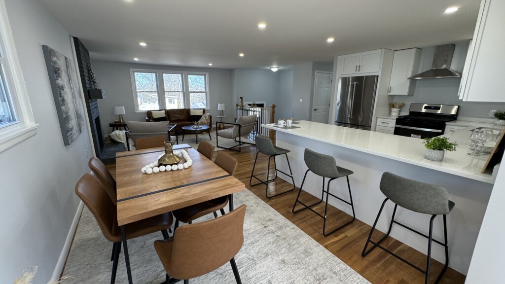
Trending dining room colors for 2025
Interior design trends for 2025 lean towards creating spaces that feel grounded, sophisticated, and deeply personal. For dining rooms, this translates into a mix of nature-inspired hues, warm undertones, and dramatic statements.
- Warm Earth Tones: Moving beyond cool grays, expect to see a resurgence of rich browns, terracotta, clay, and muted mushroom tones. These colors evoke comfort, warmth, and a connection to nature, making the dining room feel grounded and inviting.
- Deep, Muted Greens: From serene sage to luxurious olive and deep forest green, these shades continue to be popular. They bring a refreshing yet sophisticated organic feel, pairing beautifully with natural wood furniture and creating a calming ambiance.
- Rich Blues: While navy remains a timeless choice, 2025 sees an evolution towards deeper, more nuanced blues, sometimes with subtle gray or green undertones. These provide a sophisticated and cozy atmosphere, perfect for formal or intimate dining.
- Creamy & “Greige” Neutrals: White kitchens are evolving, and so are dining room neutrals. Expect warmer, softer whites and nuanced “greiges” (a blend of gray and beige) that offer a clean, versatile backdrop without feeling stark. These neutrals often have subtle yellow or red undertones, adding warmth.
- Burgundy and Wine Reds: For those seeking drama and opulence, deep burgundy and wine reds are gaining traction. These rich, saturated colors add a sense of luxury and depth, making the space feel intimate and conducive to long, enjoyable meals.
- Subtle Golden Yellows: To inject cheerfulness and warmth, soft golden yellows are emerging. These hues can brighten a dining room, especially those with ample natural light, making the space feel more energetic and welcoming.
- Deep Charcoal and Black: For a truly modern and chic statement, deep charcoal or even matte black walls create an intimate and sophisticated dining experience. When paired with lighter furniture and metallic accents, these colors can surprisingly work well even in smaller spaces.
How lighting affects paint choices
Lighting is a critical factor that can dramatically alter how a paint color appears in your dining room.
- Natural Light:
- North-Facing Rooms: Receive cooler, softer light. Colors here can appear more subdued. Warm colors might lose some vibrancy, while cool colors can feel more prominent. Consider warmer paint colors to counteract the cool natural light.
- South-Facing Rooms: Receive the most intense, direct light throughout the day. Colors will appear brighter and more vibrant. Lighter colors can feel washed out, so you might consider a slightly deeper shade to prevent this.
- East-Facing Rooms: Get bright, warm morning light, which turns cooler in the afternoon. Warm colors will glow in the morning, while cool colors might appear more subdued.
- West-Facing Rooms: Receive warm, golden light in the afternoon and evening. This can make warm colors more saturated and intense.
- Artificial Lighting:
- Incandescent/Warm LED (2700K-3000K): These lights emit a yellowish glow, which enhances warm colors (reds, oranges, yellows) making them feel cozier. They can dull cooler colors.
- Cool LED/Fluorescent (4000K-5000K+): These lights have a bluer tint. They make cool colors (blues, greens, grays) appear sharper and cleaner, but can make warm colors look muted or flat.
- Daylight LED (5000K-6500K): Closely mimics natural daylight, offering a neutral light that shows colors most accurately.
- Practical Tip: Always test large paint samples (at least 2×2 feet) on multiple walls in your dining room. Observe them at different times of day – morning, noon, and evening – and under both natural and artificial lighting conditions to see how the colors truly interact with your unique light sources.
Color psychology: Create the right atmosphere
The colors you choose for your dining room can subtly influence mood, appetite, and conversation. Harness color psychology to create the atmosphere you desire.
- Warm Colors (Reds, Oranges, Yellows, Warm Browns):
- Effect: Stimulate appetite, conversation, and energy. They create a cozy, intimate, and welcoming atmosphere.
- Ideal For: Lively dinner parties, spaces where you want guests to feel energized and engage in conversation.
- Considerations: Can feel overwhelming if too saturated or used on all walls in a small space.
- Cool Colors (Blues, Greens, Purples):
- Effect: Promote calmness, relaxation, and tranquility. They can make a room feel more spacious and serene.
- Ideal For: More relaxed, contemplative meals, or if your dining room is part of an open-concept living space where you want a smooth, calming transition.
- Considerations: Too much cool color can make a dining room feel less inviting or even sterile. Balance with warm accents.
- Neutrals (Whites, Grays, Beiges, Greiges, Taupes):
- Effect: Offer a timeless, sophisticated, and versatile backdrop. They create a sense of balance and allow other elements (furniture, artwork) to stand out.
- Ideal For: A classic, understated elegance, or if you frequently change your decor.
- Considerations: Can feel bland or cold if not layered with textures, varying shades, and warm lighting.
Classic neutrals vs. Bold accent walls
Both approaches offer distinct benefits for defining your dining room’s style.
Classic neutrals:
- Pros:
- Timeless Appeal: They never go out of style, providing a sophisticated and enduring backdrop.
- Versatility: Easily adaptable to changing furniture, decor, and seasonal themes.
- Creates Space: Lighter neutrals can make a dining room feel larger, brighter, and more open.
- Highlights Decor: Allows your dining table, chairs, artwork, and centerpiece to be the stars of the show.
- Popular Choices:
- Soft off-whites (with warm undertones)
- Creamy beiges
- Warm grays or “greiges” (gray with beige undertones)
- Light taupes
- Muted sage green (often functions as a neutral)
Bold accent walls:
- Pros:
- Dramatic Impact: Creates an instant focal point and adds personality.
- Defines Space: In open-concept layouts, an accent wall can visually delineate the dining area.
- Experimentation: Allows you to incorporate a trending or daring color without committing to the entire room.
- Adds Depth: Can make a room feel more intimate and dynamic.
- Popular Placement:
- The wall behind the dining table.
- A wall with an architectural feature (e.g., a fireplace, built-in shelving).
- In a smaller dining room, an accent wall can add interest without overwhelming.
- Bold Color Ideas:
- Deep navy or indigo blue
- Forest or emerald green
- Rich burgundy or wine red
- Charcoal gray or black
- Spicy terracotta or burnt orange
Tips for coordinating with furniture & decor
To create a cohesive and harmonious dining room, consider how your chosen paint color interacts with all other elements.
- Work with Existing Elements: If you have existing dining furniture (table, chairs, buffet) or fixed elements (flooring, built-ins) that you plan to keep, use their colors and undertones as your starting point. Do they have warm or cool undertones?
- Harmonize Undertones: This is crucial. If your wood furniture has warm (reddish-brown, yellow) undertones, choose paints with warm undertones (creamy whites, warm grays, greens, blues with yellow bases). If your furniture is cooler (grayish wood, black), opt for paints with cool undertones (cooler grays, blues, crisp whites).
- Create Contrast or Complement:
- Contrast: For dark wood furniture, a lighter paint color creates a striking, elegant contrast. For light furniture, a darker paint color can make it pop.
- Complement: For a more serene and seamless look, choose paint colors that are a few shades lighter or darker than your furniture, or that share similar undertones.
- Consider Your Dining Table: The dining table is the anchor of the room. A dark table might look best against a lighter wall, while a light or glass table can handle a bolder, moodier wall color.
- Factor in Artwork & Textiles: Your wall art, area rug, drapes, and chair upholstery should also be considered. Pull accent colors from these items for throw pillows or smaller decorative pieces, ensuring they tie into the paint color.
- Metallic Accents: The type of metal in your light fixtures, hardware, or decor (e.g., brass, chrome, matte black) can also influence paint choice.
- Warm Metals (brass, gold, bronze): Pair beautifully with warm paint colors (earth tones, warm greens, blues) or deep, sophisticated hues.
- Cool Metals (chrome, silver, brushed nickel): Look sleek with cool grays, crisp whites, or blues.
- Test, Test, Test: As mentioned, always paint large swatches on your walls. Place them next to your dining furniture, look at them with your existing decor, and observe them throughout the day. This is the only way to truly see how the color will live in your unique space.
Choosing the right paint color for your dining room is a transformative step that can set the tone for countless memorable moments. By considering trends, lighting, color psychology, and how all elements coordinate, you can create a space that is both elegant and incredibly inviting. For expert painting services and guidance on achieving your ideal dining room, trust the professionals at Greater Boston Contractors.