The exterior paint color of your house is its public face, making the first impression and setting the tone for your entire property. It’s a significant decision that impacts curb appeal, home value, and your personal enjoyment. Choosing the right colors for siding, trim, and accents involves more than just picking shades you like; it requires understanding color theory, considering architectural style, and harmonizing with existing elements. Greater Boston Contractors provides this comprehensive guide to help you confidently select the perfect exterior color palette for your home.
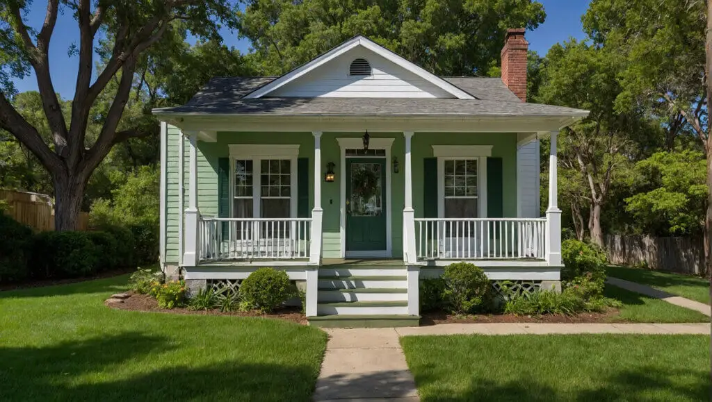
Understanding exterior color theory
Applying basic color theory principles to your home’s exterior can help you create a harmonious and visually appealing palette.
- Color Wheel Basics: The color wheel is your fundamental tool.
- Monochromatic: Using different shades, tints, and tones of a single color (e.g., various shades of gray). Creates a subtle, sophisticated, and unified look.
- Analogous: Combining colors that are next to each other on the color wheel (e.g., blues and greens). Creates a harmonious, serene, and natural feel.
- Complementary: Pairing colors from opposite sides of the color wheel (e.g., blue and orange). Creates high contrast and visual energy, often used for bold accent doors.
- Neutrals: White, black, gray, and beige are foundational. They can be warm or cool and provide a versatile backdrop for any accent color.
- Warm vs. Cool Colors:
- Warm Colors (Reds, Oranges, Yellows, Browns): Tend to make a house feel more inviting, cozy, and vibrant. They can appear to bring the house forward visually.
- Cool Colors (Blues, Greens, Purples): Tend to create a sense of calm, sophistication, and expansiveness. They can appear to recede, making a house seem larger or more distant.
- Undertones: This is crucial. Every color, even neutrals, has an underlying tint (e.g., a gray might have blue, green, or purple undertones; a white might have yellow or pink undertones). Ensuring the undertones of your main color, trim, and existing elements (like your roof or stone) harmonize is key to a cohesive look.
- The 60-30-10 Rule: A popular design guideline:
- 60% Dominant Color: The main body of your house (siding).
- 30% Secondary Color: Your trim, garage door, or architectural features.
- 10% Accent Color: Your front door, shutters, or decorative elements.
Factors that influence exterior paint choice
Beyond pure aesthetics, several practical elements should guide your color selection.
- Architectural Style:
- Traditional (Colonial, Victorian, Craftsman): Often suit classic, historical palettes—muted colors, deep greens, navy blues, creams, or historically accurate vibrant accents.
- Modern/Contemporary: Lean towards starker contrasts, monochromatic schemes, and bold, minimalist palettes with grays, blacks, and crisp whites.
- Farmhouse/Rustic: Embrace warm whites, earthy tones, muted greens, and natural wood accents.
- Coastal: Light blues, greens, sandy beiges, and crisp whites create a breezy, fresh feel.
- Existing Permanent Elements: These are your non-negotiables.
- Roof: Its color (shingle, tile, metal) is a major player. Choose colors that harmonize with its undertones. A brown roof pairs better with warm grays or earthy tones, while a black roof offers versatility with cool or warm main colors.
- Brick, Stone, or Veneer: If your house has permanent masonry elements, their colors and undertones must be considered. Pull colors directly from their palette or choose complementary hues.
- Windows & Doors: The color of your existing window frames (vinyl, metal) and entry door (if not being painted) must be factored in.
- Surroundings & Landscaping:
- Natural Setting (Trees, Foliage): Houses surrounded by lush greenery often benefit from colors that complement nature, like deep greens, earthy browns, or muted blues.
- Urban Environment: Can support bolder or more contemporary color schemes.
- Neighbors’ Homes: While you don’t want to copy, consider how your home will sit within the neighborhood. Do you want to blend in or stand out?
- Climate & Sun Exposure:
- Hot Climates: Lighter colors reflect more sunlight and can help keep your home cooler, potentially reducing energy costs.
- Cold Climates: Darker colors absorb more sunlight, which can be beneficial in colder months.
- Sunlight Intensity: Intense sun can make very light colors appear washed out or very dark colors fade faster.
Tools to visualize paint combinations
Don’t guess! Leverage these tools to see your choices before committing.
- Physical Swatches & Sample Boards: This is the most critical step. Purchase sample pots of your chosen colors and paint large swatches (at least 2×2 feet) on different sides of your house. Observe them at different times of day and in various weather conditions.
- Online Color Visualizers: Many paint brands (Sherwin-Williams, Benjamin Moore, Behr, etc.) offer online tools where you can upload a photo of your house and “paint” it virtually. These are great for initial ideas, but remember that screen colors can differ from real paint.
- Color Apps: Some paint companies have mobile apps that use augmented reality to show colors on your walls in real time.
- Professional Color Consultation: Many paint stores or professional painters (like Greater Boston Contractors) offer color consultation services. An expert can assess your home’s unique features and surroundings to recommend the perfect palette.
Matching roof, windows, and trim
These elements form the backbone of your exterior color scheme and require careful coordination with your main house color.
- The Roof: Often the largest non-paintable surface.
- If your roof is black or dark gray, almost any house color will work. This provides flexibility.
- If your roof is brown or reddish-brown, stick to warm-toned house colors (warm grays, beiges, creams, greens with yellow undertones) or muted, earthy tones. Avoid stark cool grays or blues.
- If your roof is light gray or white, it offers versatility but ensure enough contrast with the body color to prevent a washed-out look.
- Windows:
- White Window Frames: The most common. They provide a crisp contrast and generally pair well with any body and trim color.
- Dark Window Frames (Black, Bronze): These offer a modern look. You can match your trim to these frames for a cohesive statement, especially with light to medium body colors.
- Wood Window Frames: Emphasize their natural beauty by choosing body and trim colors that harmonize with their wood tone.
- Trim: The trim (around windows, doors, corners, fascia boards) should frame your house and highlight its architecture.
- White/Off-White Trim: The most popular choice, providing clean contrast.
- Dark Trim (Black, Charcoal): Creates a dramatic, modern look, especially with light body colors.
- Matching Trim to Body Color: For a softer, monochromatic look, or to make your house appear larger. Uses a slightly lighter or darker shade of the body color.
- Matching Trim to Roof/Window Frames: Can create a highly integrated design.
- Front Door: The accent piece. Choose a color that stands out and invites, usually a bolder hue that either complements or contrasts vividly with the main body color.
- Garage Door: Often a large, prominent feature. Generally, it’s best to paint the garage door the same color as the house body so it blends in and doesn’t visually overwhelm the facade.
HOA rules and neighborhood aesthetics
These external factors can significantly impact your color choices, especially in planned communities.
- Homeowners Association (HOA) Rules: Many HOAs have strict guidelines regarding exterior paint colors. Before you even pick up a swatch, consult your HOA’s rules and regulations. They often have approved color palettes or require submission for approval. Failing to comply can lead to fines or forced repainting.
- Neighborhood Aesthetics: Even without an HOA, consider the overall look and feel of your neighborhood.
- Blending In: If you prefer your home to integrate seamlessly, choose colors that are cohesive with neighboring properties.
- Standing Out: If you want your home to be distinctive, select a color that contrasts but still complements the surrounding homes and maintains architectural harmony. A unique color can still be tasteful and appealing.
- Resale Value: While personal preference is key, consider that overly bold or unusual colors might limit your pool of potential buyers if you plan to sell in the near future. Neutrals and classic palettes often have broader appeal.
Mistakes to avoid when choosing colors
Navigating the multitude of choices can be daunting. Watch out for these common missteps.
- Ignoring Undertones: The biggest culprit for a mismatched exterior. Always check the subtle cool (blue, green, purple) or warm (yellow, red, brown) undertones of all your fixed elements and potential paint colors.
- Not Testing Samples: Never choose a color from a small swatch or online image alone. Paint large samples on different parts of your house and observe them in various lighting conditions.
- Choosing Colors Indoors: Colors appear drastically different under interior lighting than they do in natural outdoor light. Take your samples outside!
- Forgetting About the Roof First: The roof is a huge, unchangeable surface. Its color and undertones should be your primary reference point.
- Overlooking the Garage Door’s Visual Impact: Painting it a contrasting color can make it an unwelcome focal point and make your house appear wider than it is.
- Too Many Colors or Too Little Contrast: A cluttered palette looks messy. Conversely, insufficient contrast between body and trim colors can make your house look flat.
- Not Considering Your Landscape: The natural elements around your home are part of your color scheme.
- Rushing the Decision: This is a long-term commitment. Take your time, test options, and get feedback.
Choosing the right exterior paint colors is a significant investment in your home’s curb appeal and longevity. By understanding these key factors and utilizing smart visualization tools, you can create a cohesive, beautiful, and lasting impression. For expert exterior painting services and a flawless finish, trust the professionals at Greater Boston Contractors to bring your vision to life.