Walnut is one of the most highly prized wood species in residential flooring and furniture. Known for its deep, rich brown color, natural complexity, and elegant grain, walnut floors instantly lend a sense of luxury and permanence to any dining room. However, selecting the right wall color to complement its depth is crucial; the wrong shade can make the room feel heavy, dated, or unbalanced.
Greater Boston Contractors specializes in the cohesive design of high-end spaces. Here is your essential guide to pairing dining room colors that harmonize perfectly with the warm sophistication of walnut flooring.
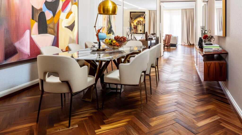
Understanding Walnut Floor Undertones
Before selecting paint, you must understand the subtle colors embedded within the walnut wood itself. This is key to successful color matching.
Warm Brown and Red Undertones
True American black walnut typically features complex undertones that lean toward the warm side of the spectrum:
- Deep Chocolate Brown: The primary color, which provides the anchor for the entire space.
- Subtle Red or Purple: Depending on the cut and stain, walnut often carries reddish or slightly purplish hints, which must be acknowledged to avoid clashing.
- Avoid Clashing: To prevent a color fight, your wall color should either contain a similar warm undertone (monochromatic harmony) or be a cool color that acts as a clean, crisp contrast (complementary contrast).
How Lighting Affects Walnut Flooring
Walnut is a naturally dark wood, and its appearance shifts dramatically based on the light source.
- Natural Light: Large windows will bring out the natural grain and the wood’s inherent warmth. Lighter wall colors are essential here to prevent the room from feeling cave-like.
- Low Light/Evening: Walnut can appear almost black or extremely moody in the evening. In this setting, soft, warm overhead lighting is necessary to prevent the floor from disappearing into the shadows.
Best Wall Colors for Walnut Floors
These colors provide reliable, stylish pairings that enhance the beauty and richness of the walnut.
Warm Whites and Creams
These are the safest and most effective choices for creating a sophisticated, airy space, especially for open-concept dining rooms.
- Why they work: A soft white or cream (with a yellow or beige base, not a blue base) provides maximum contrast without competing with the depth of the floor. They lift the ceiling, reflect light, and keep the rich walnut tone as the star of the room.
- Example Shades: Sherwin-Williams Alabaster, Benjamin Moore White Dove.
Soft Beige and Greige
If you desire a warmer, cozier envelope, medium-tone neutrals work well, provided they are not too saturated.
- Greige (Gray + Beige): A perfect neutralizer. Greige walls (like Benjamin Moore Revere Pewter) draw out the coolness of the deep brown in the walnut, creating a balanced, highly popular transitional look.
- Soft Beige: Choose a beige with a subtle gold or cream undertone to echo the natural warmth of the wood without becoming too yellow.
Muted Greens and Blues
These colors offer a beautiful, sophisticated contrast because they sit opposite brown/red on the color wheel.
- Muted Sage Green: A beautiful choice that feels natural and grounding. The earthiness of sage works harmoniously with the wood’s organic feel.
- Deep Navy or Indigo Blue: Excellent for a dramatic, formal dining room. The deep cool tone of the blue provides a stark contrast against the floor’s warmth, lending an expensive, tailored feel.
Charcoal or Deep Gray for Contrast
For a bold, moody, and highly contemporary dining room, consider a near-black shade.
- Effect: Painting the walls in a dark charcoal or slate gray allows the walnut to truly pop. This look requires abundant natural or architectural lighting to ensure the room does not feel oppressive.
- Tip: Use a high-sheen paint finish (like satin or semi-gloss) on the walls to reflect light and prevent the dark colors from feeling flat.
Colors to Use Carefully
These shades can easily clash with the walnut’s natural undertones, leading to visual tension and a disjointed look.
Very Dark Browns
Pairing a dark walnut floor with walls painted a dark chocolate brown can overwhelm the space, resulting in a room that feels smaller and lacks visual definition. If you love brown, choose a medium taupe or a light mushroom brown instead.
Strong Reds or Oranges
Because walnut often has natural reddish undertones, introducing highly saturated reds, terracotta, or vibrant oranges on the wall can cause the room to look overly stimulating and compete directly with the wood, making the whole space appear muddy or overly busy. Stick to muted, dusty versions of these shades if you must use them.
Coordinating Trim, Furniture & Lighting
A successful dining room design integrates the floor, walls, and all accessories into a single, cohesive statement.
Trim Color Choices
- Classic Approach: Use a crisp, clean white (like Benjamin Moore Chantilly Lace) for all trim, crown molding, and wainscoting. This provides a sharp, clean line against the dark floor and the wall color, helping define the architectural elements.
- Monochromatic Approach: Use the same light wall color on the trim but in a higher sheen (e.g., matte on the wall, semi-gloss on the trim). This softens the visual contrast and makes the room feel taller.
Wood Furniture Matching vs. Contrast
- Avoid Exact Match: Never try to match your dining table or chairs to the walnut floor exactly. The slight mismatch often looks accidental.
- Best Strategy: Contrast: Choose furniture in a lighter wood (like maple or ash) or in a painted finish (white, black) to contrast sharply with the floor. Alternatively, choose very dark woods (like ebony-stained) that are intentionally darker than the floor.
Warm vs. Cool Lighting Temperature
- Recommendation: Warm Lighting (2700K – 3000K): Walnut thrives under warm, soft white light. This lighting temperature enhances the wood’s natural brown and red tones, contributing to a cozy, inviting dining atmosphere.
- Avoid: Cool white or blue-toned lighting (4000K and above), which can make the rich walnut floor look dull, flat, or gray.
FAQs
Do walnut floors work with gray walls?
Yes, exceptionally well. The pairing of walnut floors with soft gray, light charcoal, or greige walls is a hallmark of modern transitional design. The gray provides a cool, clean element that beautifully balances the inherent warmth of the walnut, resulting in a sophisticated and contemporary look.
Should dining rooms be darker or lighter than adjacent rooms?
This depends on the desired atmosphere:
- Formal/Intimate: Dining rooms are often painted in a slightly darker or more saturated color than adjacent hallways or living rooms to create a distinct, intimate, and dramatic zone.
- Open Concept: For seamless flow, the dining room should maintain the same shade or a very slightly darker hue within the same color family as the adjacent room.
What finish makes walnut floors stand out?
A satin or semi-gloss finish is typically the best choice for walnut floors. These finishes provide enough reflection to highlight the wood’s rich color and complex grain pattern without the maintenance challenges or overly reflective nature of a high-gloss finish.
Ready to select the perfect colors and materials for your home’s enduring elegance?
Contact Greater Boston Contractors today for professional design consultation, finish material selection, and expert installation of your new walnut flooring!