Choosing the perfect white paint is surprisingly complex. A slight shift in undertone can dramatically change a room’s mood, making it feel either stark and cold or cozy and inviting. If your goal is a space that feels soft, welcoming, and relaxed, you need a warm white.
At Greater Boston Contractors, we understand how color choice impacts the final look of a remodel. Here is our expert guide to understanding and selecting the best warm white paint colors for your home.
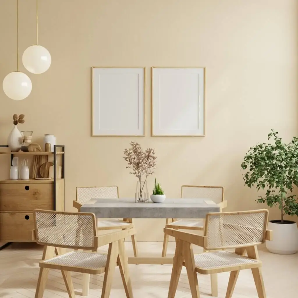
What Makes a White Paint “Warm”?
White paint is rarely pure white; it is created by adding trace amounts of other colors. This subtle addition dictates whether the color is perceived as warm or cool.
Yellow, Red, and Beige Undertones
Warm whites are created by mixing in pigments that have a red, yellow, or beige base. These pigments soften the bright intensity of the white.
- Yellow Undertones: Make the white look creamy or buttery.
- Red/Pink Undertones: Can create a subtle blush effect, making the color feel very soft.
- Beige/Greige Undertones: Add earthiness and depth, often keeping the color from looking too yellow.
Why Warm Whites Feel Cozy vs. Cool Whites
Warm whites have a higher perceived light reflectance value (LRV) under artificial light because they mimic the warmth of the sun or incandescent bulbs. They reflect light without bouncing back blue tones, which are common in cool whites (which contain blue, gray, or purple pigments). The result is a color that feels enveloping, relaxed, and inherently cozier.
Most Popular Warm White Paint Colors
These four paint colors are perennial favorites because they achieve a perfect balance of warmth without reading as truly yellow or beige.
Sherwin-Williams Alabaster (SW 7008)
- The Look: Alabaster is a soft, subtle, off-white that carries a touch of creaminess without being overwhelming. It has minimal yellow pigment, making it extremely versatile.
- Best Used: As a whole-house color, particularly on exterior trim and for creating a calming atmosphere in bedrooms.
Benjamin Moore White Dove (OC-17)
- The Look: One of the most balanced and classic warm whites. It has a slight hint of gray/greige undertone, which keeps the yellow from becoming too obvious.
- Best Used: In kitchens and bathrooms where you want a clean look but need to avoid the starkness of a pure white. It pairs beautifully with marble and natural wood.
Benjamin Moore Simply White (OC-117)
- The Look: A bright, high-LRV white that leans slightly warm. It has yellow undertones but enough saturation to hold its own without looking creamy.
- Best Used: On trim and cabinets, especially in rooms with northern exposure (which tends to cast a cool, gray light). Simply White combats the cool light beautifully.
Sherwin-Williams Creamy (SW 7012)
- The Look: True to its name, Creamy has the most noticeable yellow-gold undertone of the group. It reads distinctly warmer and richer than Alabaster.
- Best Used: In historic or traditional homes where a deeper, softer white is desired, or in rooms that receive very little natural light.
How to Choose the Right Warm White
Testing and comparison are essential, as the final color depends heavily on the unique conditions of your home.
Consider Your Natural Lighting
- North-Facing Rooms: Receive cool, gray light all day. Use a white with slightly stronger yellow/red undertones (like Simply White or Creamy) to counteract the coolness.
- South-Facing Rooms: Receive intense, bright light. Use a more neutral warm white (like Alabaster or White Dove) to keep the warmth from turning excessively yellow under the direct sun.
Compare Undertones to Floors & Furniture
If your existing hardwood floors have strong red tones (cherry, mahogany), pick a warm white with a hint of red or beige undertone to harmonize. If your furniture is gray or greige, choose a white with a slight gray undertone (like White Dove) for a seamless transition.
Test Samples at Different Times of Day
Always purchase samples and paint large swatches (at least 2×2 feet) on several walls in the room. Observe the color multiple times:
- Morning Light: Tends to be cool.
- Mid-Day Light: Brightest and truest.
- Evening/Artificial Light: The warmest test (often where yellow tones become most apparent).
Where Warm Whites Work Best
Warm whites are versatile, but they excel in areas where comfort and softness are paramount.
Living Rooms and Open Spaces
Warm whites provide a soft, unifying backdrop for open floor plans. They create a continuous flow without the stark division that a pure white or stark color might impose.
Bedrooms and Hallways
The calming, cozy nature of a warm white is perfect for bedrooms, promoting relaxation. In windowless hallways, warm whites maximize the impact of artificial lighting, making these transitional spaces feel brighter and more inviting.
Kitchens Paired with Wood Tones
In kitchens featuring stained wood cabinetry, butcher block islands, or hardwood floors, a warm white on the walls or perimeter cabinets prevents the room from feeling too cold or utilitarian. It creates a classic, timeless partnership.
FAQs
“Do warm whites look yellow?”
A well-chosen warm white will look soft and creamy, not yellow. If your sample is turning noticeably yellow, it likely has too high a yellow LRV for the natural light in your room. This usually happens in bright south-facing rooms.
“Are warm whites good for modern homes?”
Yes. While pure white is often associated with minimalism, contemporary design emphasizes layered textures. Using a warm white on the walls provides a soft canvas that allows modern materials like black metal, glass, and concrete to stand out without making the room feel sterile.
“How do I avoid picking a too-creamy shade?”
Look at the Light Reflectance Value (LRV) of the paint. Whites with an LRV above 82 tend to be cleaner. Also, look for whites that have a slight touch of greige or gray in their undertone (like White Dove), as this neutralizes the yellow pigment, keeping the color crisp rather than buttery.
Ready to find the perfect shade for your next remodel? Choosing the right white is the first step toward a stunning finished space.
Contact Greater Boston Contractors today for a color consultation as part of your comprehensive remodeling project!