The kitchen is one of the most used—and loved—spaces in any home. It’s where meals are made, conversations happen, and memories are created. That’s why choosing the right paint color is so important. The right shade can make your kitchen feel welcoming, stylish, and even more functional.
Here are five timeless and trendy kitchen wall colors, along with expert insight into what to avoid when painting this key space.
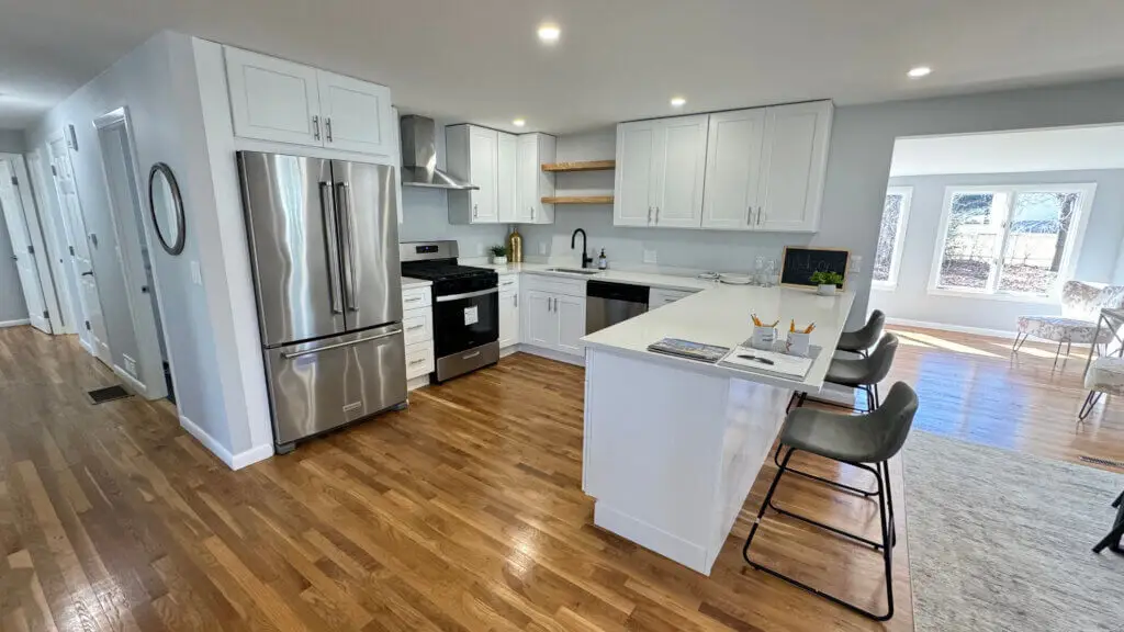
What color combination paint is best for a kitchen?
Whether you prefer a modern look or a cozy vibe, these five paint colors work beautifully in most kitchen layouts and pair well with a variety of cabinetry and countertops:
1. Warm white
A classic choice that brightens the space and complements almost any kitchen style. Use it with natural wood, black accents, or colorful décor. Warm white avoids the starkness of pure white, making the room feel more inviting.
2. Soft gray
Neutral yet elegant, soft gray works well with both warm and cool palettes. It’s perfect for modern kitchens with stainless steel appliances or marble countertops. Add navy, black, or brass for contrast.
3. Sage green
Earthy and calming, sage green brings a touch of nature into your kitchen. It’s ideal for farmhouse or boho-inspired spaces and pairs beautifully with white cabinets and wood textures.
4. Navy blue
For a dramatic, upscale feel, navy blue creates contrast and depth—especially when used on an accent wall. It works well with white or gold hardware and gives modern kitchens a sleek edge.
5. Terracotta or clay
Warm, grounded tones like terracotta are rising in popularity. They create a cozy, rustic vibe and work wonderfully with natural stone, copper, or brass elements. It’s a great choice for Mediterranean or eclectic kitchen styles.
What color not to paint a kitchen?
While color choice is personal, there are a few shades that tend to work against the purpose of a kitchen:
- Bright red: Though stimulating, it can feel aggressive or overwhelming in larger doses.
- Neon or overly saturated tones: These can clash with cabinets and countertops, making the space feel visually chaotic.
- Pure black: Unless used as a contrast or in a very well-lit space, it can make kitchens feel small and closed in.
- Cool, stark white: If too bright or icy, it can make the kitchen feel cold or sterile—opt for warmer undertones instead.
Choosing the right color isn’t just about trends—it’s about creating a space where people want to gather.
Need help? Contact a painting company like ours
At Greater Boston Contractors, we help homeowners choose the perfect colors, finishes, and techniques to elevate their kitchen spaces. From small paint refreshes to full remodels, our expert team ensures clean lines, durable products, and a flawless finish every time.
We bring knowledge, efficiency, and care to every brushstroke—so your kitchen feels like the heart of the home.
Not sure which paint color works best for your kitchen?
Let Greater Boston Contractors help you create a warm, stylish, and functional space. Contact us today for a color consultation and professional painting services you can trust.